I’m sure most of us will agree that we all need a refresh every now and then. Sometimes that means a new hairstyle or an updated wardrobe. Sometimes it’s a change of scenery to a new home. Whatever the rebrand, it feels good to make a fresh change that reflects who you are now. That’s just what this seasoned senior living community needed. After 30 years, this community was ready to rebrand and embrace the spirit and personality that it now represents in its prime.
the background
Emerald Heights is a Pacific Northwestern Life Care senior living community located in Redmond, WA. The community is well-known as the premier choice for senior living in the area. Its persona is laid-back, woodsy, and environmentally friendly.
The community is located in an active, forested city. Hiking, boating, and other outdoor activities are popular among Redmond residents. Tucked back in a wooded area, the campus has a popular walking path that remains a central piece of the community. The residents who call Emerald Heights home are 55+ and remain active with the many outdoor activities available to them. They embrace the walkability of the campus and explore the nature of the area with frequent hikes on nature trails as well as nearby shopping areas and wineries.
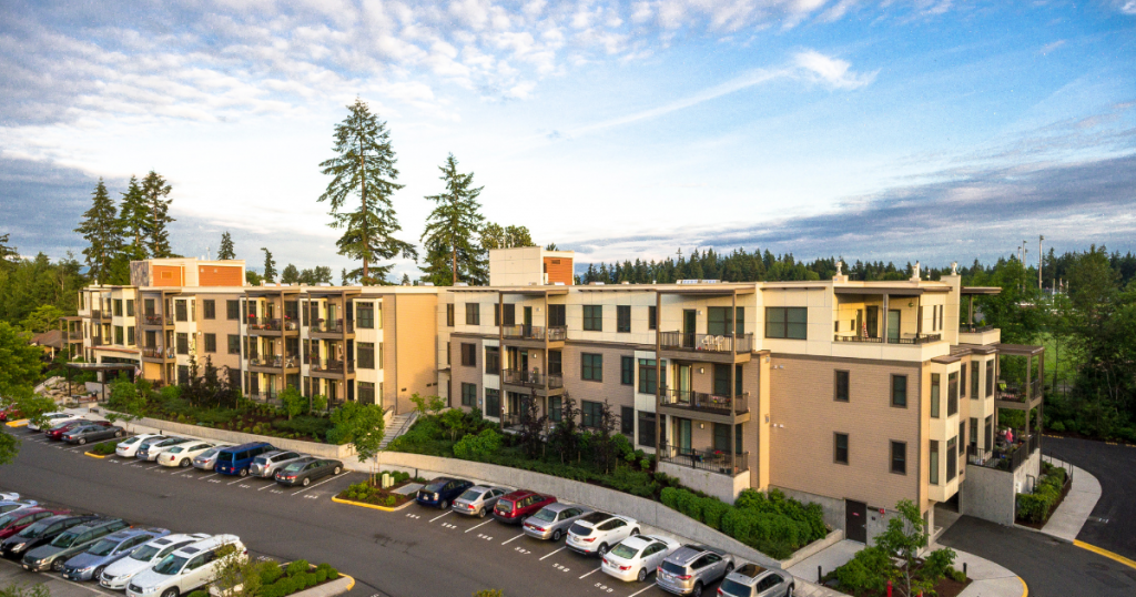
The community is also undergoing physical updates to the interiors and exteriors. Since the community is bringing a modern flair to their buildings, it’s the perfect time to embrace a modern look for the entire brand.
the opportunity
Emerald Heights has 30 years of experience serving the seniors in the community. As a result, the seasoned senior living community has established its character and place in the greater community.
But the brand visuals were no longer representing the active personality that the residents and community exuded. Our goal was to rebrand the community to highlight its modern, active, outdoorsy residents but stay true to its cultivated brand identity.

Its features were flat and one-dimensional. The rest of the brand elements were similarly flat and lacked texture. The dark shades of blues, greens, oranges, and browns contributed to an uninviting and unapproachable feel. A loopy cursive font was used to bring texture to the design. Though, the typography was often used in conjunction with a harsh black color that conflicted with the font choice.
This dated and lackluster look was certainly no longer reflecting the vibrant, fun, outdoor-loving residents that fill the halls and walking trails of Emerald Heights, but rather a seasoned senior living concept. Therefore, it was clear to us that a brand overhaul was in order.
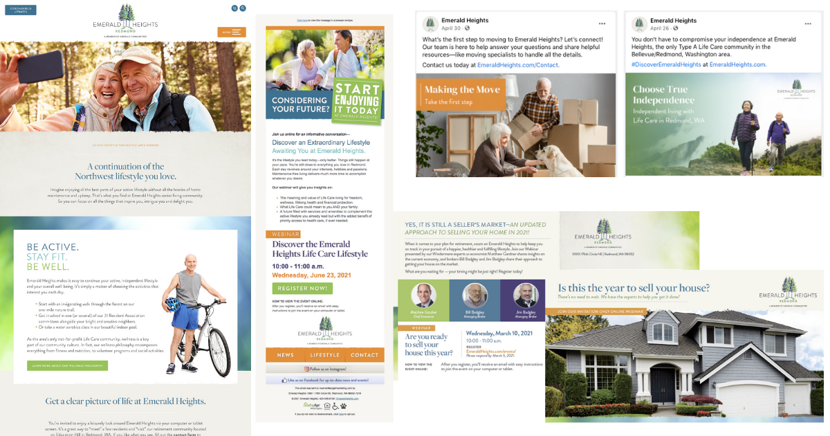
This included:
- A new logo
- New brand standards
- New website
- Updated collateral
- Refreshed social media
the results
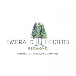
The community’s wooded location is a unique identifier. Therefore, we aimed to keep this theme in the new logo and branding. We investigated over 20 different variations of nature. These included pine cones, trees, leaves, and many more.

Emerald Heights is part of a family of sister communities. So, the new branding needed to complement the branding elements of the other communities as well. The sister locations’ logos used a brushstroke technique that added texture and lightness to the design.

Looking Forward
The brand rollout began at the start of 2021 with an exciting announcement to the community. Emerald Heights introduced the new branding to the staff and residents, who were happy to see their spirit represented in the new look. An updated look on social media, collateral and direct mail pieces followed—inviting prospective residents into the new brand identity.
Next up, the brand-new, refreshed website will go live and a photoshoot will capture the true vibrancy of the residents who live there.
The Emerald Heights family welcomes prospective residents with a fresh new look that encapsulates the community’s way of life like never before.
Next Up
Explore more here with Lesli Knee’s experience creating a brand identity from scratch for a brand-new community under development, and contact us to learn more about our branding services.
Help REALLY Wanted
New Perspectives on Hiring in Senior Living Are Picking Up Steam Hiring for senior living and retirement communities, particularly in higher levels of care, has historically been a challenge. But it’s one most communities have met…
5 Steps To Set Your Marketing Team Up For Success
Has your sales and marketing team ever needed to push to meet year-end goals in the last stretch of the year? It’s stressful, challenging to make up for lost time, and doesn’t make for a happy…


