The Challenge
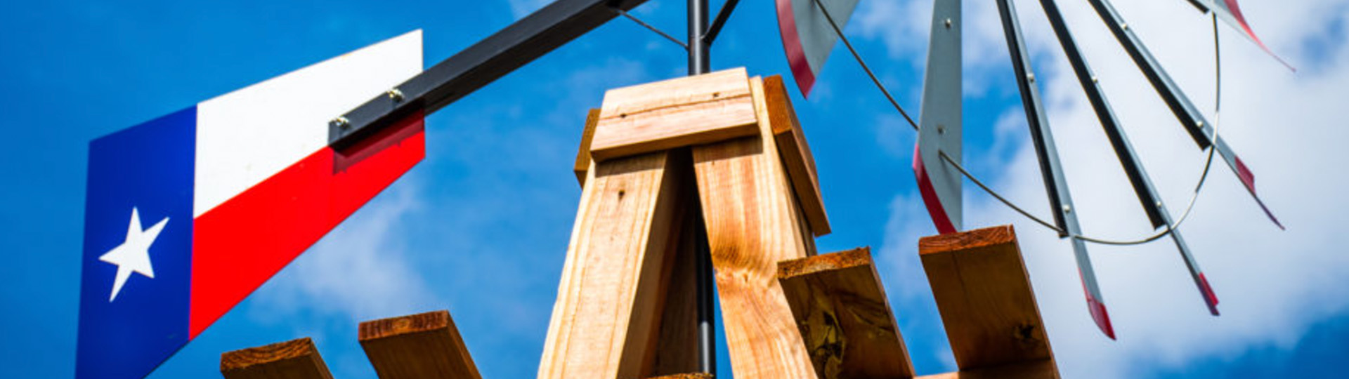
Carillon Senior Living, located in Lubbock, Texas, was founded in 1975, and has a strong pride of place. With deep roots in the area, the client was reluctant to consider partnering with an “outside” agency. But with clients from coast to coast, Angell Marketing’s discovery process takes us handily from outside to inside in a way that, again and again, turns doubt into appreciation for a successful partnership.
- Logo Redesign
- Fleet Graphics
- Direct Mail
- Photography
- Website Redesign
The Angell Marketing Solution
We spend a great deal of time and effort to learn about the client, the market area and most importantly, the residents as we believe any community’s best prospects are just like their best customers. We performed focus groups with residents, staff and the community’s leadership. Not surprisingly, we found them to be very articulate about their identity and what sets them apart. Conservative, patriotic and loaded with spirit were characteristics that came through loud and clear.
Armed with this critical information and insight we produced strategic marketing, media, budget and creative recommendations. These included the development of a brand identity to be expressed in a redesign of the logo, the addition of vehicle branding, plus new collateral and website development featuring new custom photography.
Updating the Community Logo
Carillon’s existing logo was not reflective of the spirit of the community and the prospects it wants to attract. We introduced a logo design that incorporates a more vibrant color, font and brand style to appeal to a younger, more active independent living consumer. The result is a stronger, more straightforward and confident visual.
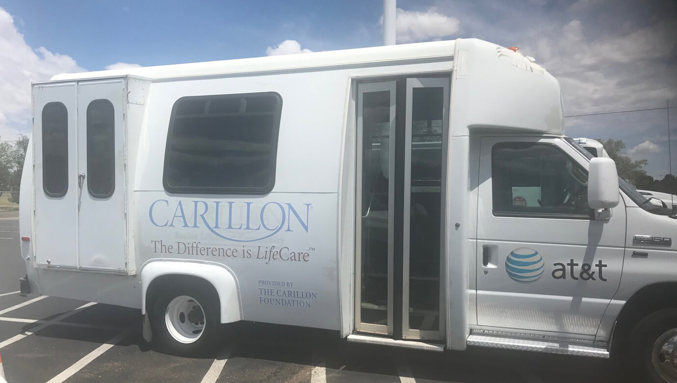
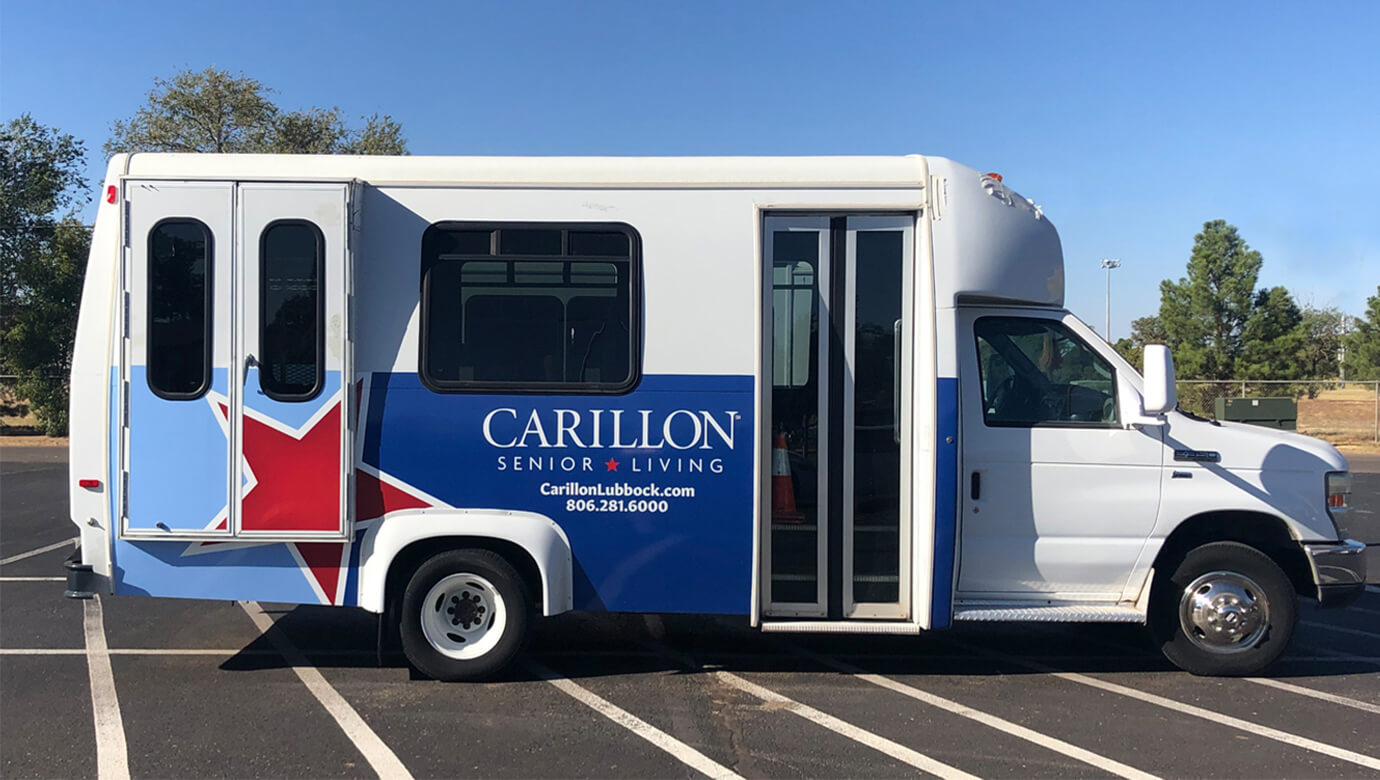
Outfitting the Community Vehicles
Carillon’s community vehicles offered a tremendous opportunity to feature the new logo as a rolling billboard for the community. The new logo and supportive fleet graphics presented a much stronger, more confident appearance.
Redesigning the Collateral & Direct Marketing Materials
Using the newly developed photography, we produced all new collateral materials that present the vibrant, friendly, engaging lifestyle that exists for those who choose Carillon as their new home. We also took care to make sure the new materials included a strong reference to the community’s neighbor and partner, Texas Tech University. The relationship is important, not only to Carillon, but also to the Lubbock community at large. In other words: “We’re fresh. We’re local. We’re Lubbock.”


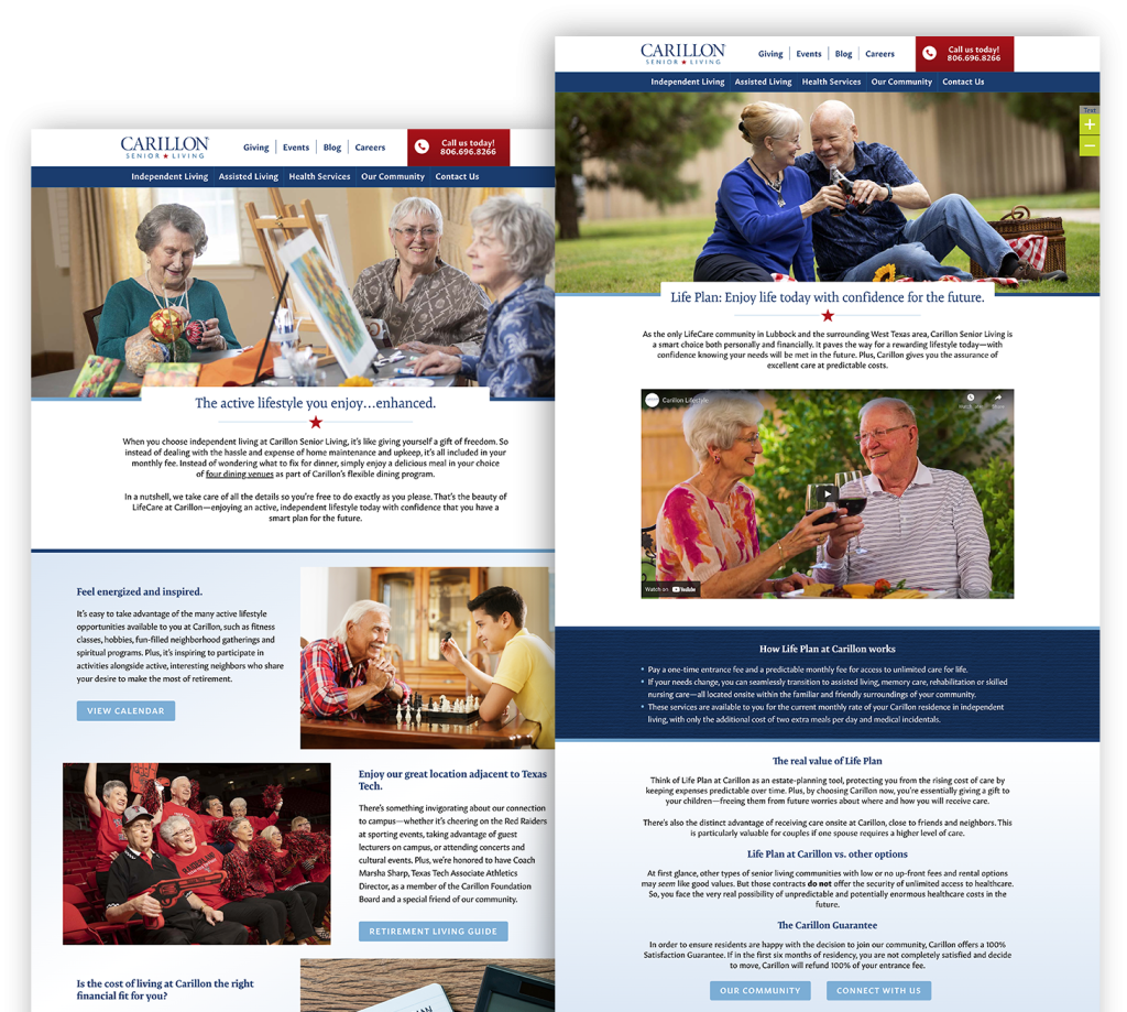
Redesigning the Website
Our UX analysis suggested the existing website was not user-friendly, which led us to several recommendations for improvement, including:
- Revise the look to reflect the lifestyle that focuses on the independent living consumer.
- Simplify the copy to allow for good search engine optimization while reducing unnecessary scrolling.
- Simplify the Contact Us form and add it to each page of the navigation.
- Use new photography and video featuring residents to help tell a visual story that showcases the features and benefits of the community.
- Use a cleaner, crisper font to make text more readable and the experience more enjoyable for the site visitor.
https://www.carillonlubbock.com/
The Results
With an identity and messaging more reflective of the community’s personality and history in the area, the marketing team has more effective tools in their toolbox as they continue to nurture fruitful relationships with age- and income-qualified prospects.
Connect With Us
Get to know us. We think you’ll like us. Our clients will tell you they do. They’ll also tell you they like the results we get them.